
User interfaces serve as the primary platform where individuals execute essential setup tasks and make modifications, ensuring the device functions according to their specific preferences and requirements. A well-designed interface can significantly enhance the user experience by providing intuitive navigation and efficient control, yet delivering this polish in resource-constrained environments presents a constant technical challenge.
Dear ImGui offers a compelling path to building these interfaces – one that’s lightweight, flexible, and particularly well-suited to environments where CPU cycles and memory are at a premium. Originally developed for internal debugging utilities, this C++ library utilizes an immediate-mode architecture that evaluates and renders interface elements frame-by-frame. This approach results in a minimal memory footprint, making it exceptionally reliable for commercial embedded targets.
What is Dear ImGui?
Dear ImGui is an open-source graphical user interface library written in C++. ImGui stands for Immediate Mode Graphical User Interface; this means that it renders and evaluates widgets on the fly during every frame of your render loop, instead of typical UI libraries storing widgets in memory.
Because it doesn’t store in memory everything that is rendered, Dear ImGui is exceptionally lightweight, fast, and portable. It is also renderer-agnostic, as it outputs simple vertex buffers that plug easily into OpenGL, DirectX, Vulkan, or custom 3D pipelines, giving developers flexibility. Another great feature is that the library is self-contained (it doesn’t need external dependencies), making it easy to maintain in your project.
Why use ImGui in embedded solutions?
While ImGui was originally designed for quickly making debugging tools and, in general, developer-side UI, many points make it a great option for embedded systems:
Minimal memory overhead: ImGui keeps virtually zero persistent widget state, drastically reducing static RAM and stack consumption.
Versatile: although there are not many out-of-the-box styles for widgets, almost anything can be achieved with the tools provided.
Self-contained: Dear ImGui has no external dependencies. The entire library can be dropped straight into any C/C++ build system (CMake, Make, or ESP-IDF).
Display & graphics agnostic: ImGui doesn’t care how you draw pixels. It outputs optimized vertex arrays and texture commands. You can route its output through OpenGL ES, Vulkan, DirectFB, or custom software.
Easy to code with AI: all of the rendering is done by describing the widgets with code, which makes it very easy for LLMs to generate code matching the desired design.
The default style: function over form
Dear ImGui’s out-of-the-box style fits its core purpose perfectly: internal developer tools. By default, it adopts a dark theme built for high information density, featuring sharp edges, crisp borders, and compact padding that squeeze maximum utility out of your screen. Combined with high-contrast blue accents and a readable but pixelated bitmap font, the layout favors raw function over visual polish. It’s practical, easy to read, and ideal for debugging – but not customer-friendly.
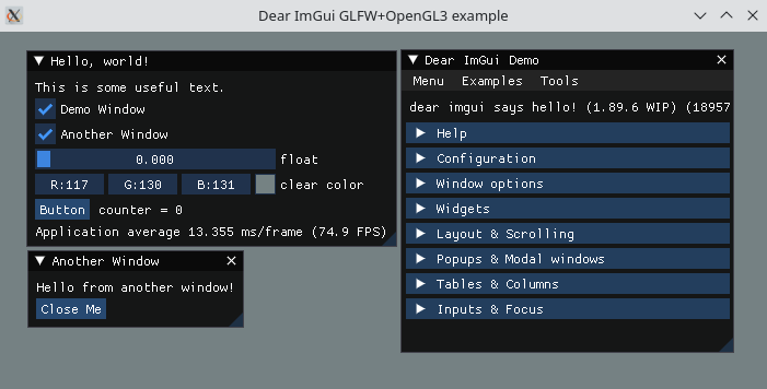
Source: https://thescienceofcode.com/imgui-quickstart/
What can be achieved?
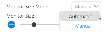
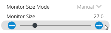
First, let’s see a few examples of what can be achieved in ImGui:
Custom dropdown:
Custom Slider with buttons on the sides:
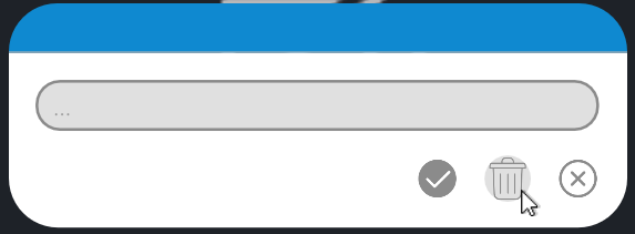
Text input popup:
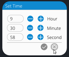
Set time popup:
How to work around forced styles
Working with documentation to find all style colors and style variables is the first step in upgrading the look of your UI. Alternatively, you can use LLMs. Below you will find a diagram of the step-by-step logic for how you can make a fancy slider. Then, the code will show this process (without adding icon buttons on the side, as this is just using a group, buttons, and SameLine functions).
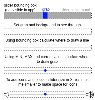
					// --- Set Grab and Background colors to see through ---
    constexpr float NO_BORDER = 0.0F;
    constexpr ImVec4 SEE_THROUGH_VECTOR = ImVec4(0.0f, 0.0f, 0.0f, 0.0f);
       ImGui::PushStyleColor(ImGuiCol_FrameBg, SEE_THROUGH_VECTOR);
       ImGui::PushStyleColor(ImGuiCol_FrameBgHovered, SEE_THROUGH_VECTOR);
       ImGui::PushStyleColor(ImGuiCol_FrameBgActive, SEE_THROUGH_VECTOR);
       ImGui::PushStyleColor(ImGuiCol_SliderGrab, SEE_THROUGH_VECTOR);
       ImGui::PushStyleColor(ImGuiCol_SliderGrabActive, SEE_THROUGH_VECTOR);
       ImGui::PushStyleVar(ImGuiStyleVar_FrameBorderSize, NO_BORDER); // removes paddings for better control of the sizes
					// --- Draw the slider's background line (as we use the slider width we can draw it before creating the slider - to get correct cursor position ---
       const ImVec2 sliderPosMin = ImGui::GetCursorScreenPos();
					       const ImVec2 sliderPosMax = ImVec2(sliderPosMin.x + sliderWidth, sliderPosMin.y + ImGui::GetFrameHeight());
       const float lineY = sliderPosMin.y + (sliderPosMax.y - sliderPosMin.y) * HALF;
       constexpr float THICKNESS = 2.0F;
       drawList->AddLine(ImVec2(sliderPosMin.x, lineY), ImVec2(sliderPosMax.x, lineY), COLOR, THICKNESS);
					// --- Draw the invisible slider widget ---
       ImGui::PushItemWidth(sliderWidth); // useful when you want to keep sliders consistent and want to make sure buttons on the sides are visible
       bool sliderValueChanged = ImGui::SliderFloat("##slider", &value, minValue, maxValue, "", ImGuiSliderFlags_NoInput);
// --- Draw the custom circle handle ---
const ImVec2 slider_box_min = ImGui::GetItemRectMin();
const ImVec2 slider_box_max = ImGui::GetItemRectMax();
const float fraction = (static_cast<float>(value) - static_cast<float>(minValue)) /
(static_cast<float>(maxValue) - static_cast<float>(minValue));
const float radius = (slider_box_max.y - slider_box_min.y) * QUARTER;
const float posX = ImLerp(slider_box_min.x + radius, slider_box_max.x - radius, fraction);
const ImVec2 circleCenter = ImVec2(posX, (slider_box_min.y + slider_box_max.y) * HALF);
constexpr int SEGMENTS = 16;
drawList->AddCircleFilled(circleCenter, radius, COLOR, SEGMENTS);</float></float></float></float>
Building a great-looking UI with Dear ImGui comes down to creative design and a solid grasp of basic geometry. By using the ImDrawList API, you can draw custom shapes, paths, and gradients to match virtually any design. While a bit more difficult to work with, the result is very fast and functional, while still keeping memory usage low.
TIP: Wrap those custom draw calls into reusable helper functions, for example: RenderCustomCombo(), RenderButton(), or RenderStyledSlider(). Defining your visual logic once in a template ensures your entire application stays visually consistent and makes developers' jobs easier.
Key Takeaways
Immediate Mode Efficiency: Dear ImGui’s frame-by-frame rendering eliminates the need for persistent widget storage, making it ideal for resource-constrained environments.
Embedded Suitability: With zero external dependencies and minimal memory overhead, it integrates seamlessly into C++ build systems like ESP-IDF and CMake.
Customization Beyond Themes: While
ImGuiStylehandles basic colors, theImDrawListAPI is the key to creating bespoke geometry, gradients, and professional-grade visuals.Interactive Custom Shapes: Since
ImDrawListis for rendering only, you must useImGui::InvisibleButton()to define functional hitboxes for custom-drawn components.Maintainable Architecture: Encapsulate custom draw logic into reusable helper functions (e.g.,
RenderStyledSlider()) to ensure visual consistency and code readability.
Frequently Asked Questions
Should I use ImDrawList or just customize ImGuiStyle variables?
Start with ImGuiStyle for quick changes like global theme colors, window rounding, and component padding. Reserve ImDrawList for when you need unique shapes, custom graphs, or controls that standard ImGui doesn’t provide natively.
Do custom shapes drawn with ImDrawList automatically handle click and hover events?
No. ImDrawList only handles drawing vectors/pixels. To make a custom shape interactive, you’ll need to use helper functions like ImGui::InvisibleButton() to define a clickable hit region over your custom-drawn shape.
Can I use ImDrawList to draw behind existing ImGui controls?
Absolutely. ImGui provides ImGui::GetWindowDrawList() (draws within the normal layer order), GetBackgroundDrawList() (draws behind windows), and GetForegroundDrawList() (draws over everything on screen).
Will wrapping custom UI code in helper functions impact performance?
Not in any noticeable way. Modern C++ compilers inline simple helper functions easily. If the function is too large to inline, it simply means you made the right choice by moving the code to the helper function instead of copy-pasting it everywhere!